

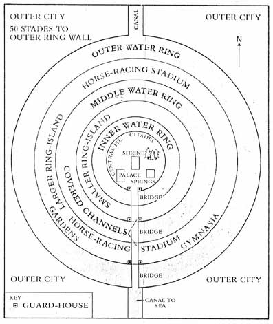

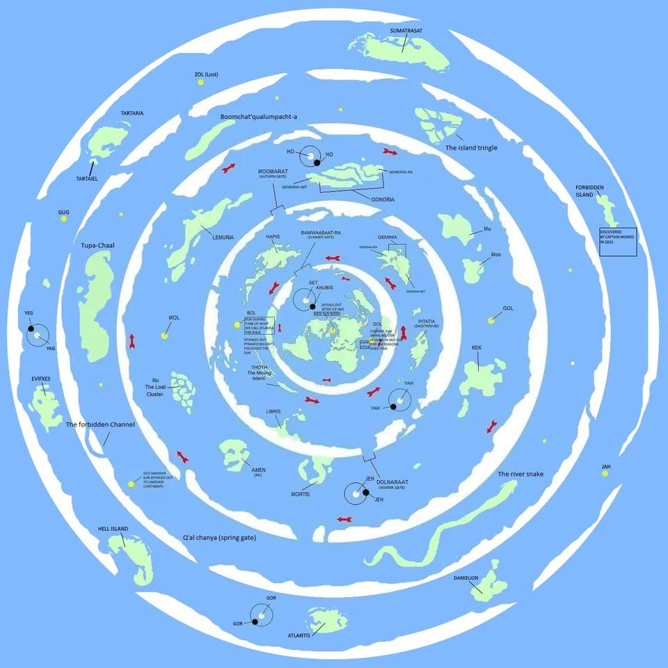

In a stylised graphic logo, olive branches and laurel leaves are virtually indistinguishable. However, their physical arrangement tells the true story: they are not arranged naturally; they are forced into the precise, semicircular shape of the Roman Imperial Laurel Crown—the ultimate symbol of absolute ownership, domain, and corporate conquest that surrounds an azimuthal projection of the world, depicted as an inertial plane of equilibrium (that intersects a double toroidal field) shaped as plane, plate or disc. Notice how, across almost every single logo in the image, this crown forms a rigid, geometric boundary wall wrapping around the central target. It is a literal visual casing. It signals that whatever is inside that circle (whether it is the flat map, a human figure, a child, or a symbol of health) is contained under the jurisdiction of the corporate entity in control. Every single logo in this corporate grid relies on the exact same monochrome colour scheme: Sophianic Blue and White. This specific shade is not a random aesthetic choice. It is the signature of the Blue-Shift centripetal energy—the nonphysical, magnetic potentiality of the unmanifest source.

‘Sky Dancer‘
“First and foremost, a woman’s true identity
Is a: ‘Direct-Extension-of-Source-Energy’
She is not merely a body; she is an immortal spiritual being
Of energy, frequency and vibration
And her body is her avatar, vehicle, chassis, an envelope for her soul
Necessary to experience a temporal journey in this world
And although equipped with a womb, a magical portal
Through which frequency is alchemised into matter
Delivering avatars in one’s own likeness
May not necessarily be one’s primary point of focus
Unless said process assists one to become
A Mistress of Alignment with Source-Energy
As a direct descendant of the supreme abode
Beyond the ætheric regions
Reconstituted into organic corporeity
As part of one’s never-ending journey of expansion…”
The full version is published on page 337 of Nóēma Poēma 2nd Edition.



You must be logged in to post a comment.